The Typography of Voyage Embarkation
Thursday, December 24, 2020 at 3:52am
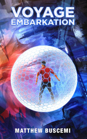
Voyage Embarkation recieved the last of the interior design revamps I did as part of my 2020 book series. As a result, it is an iteration of everything I learned over the course the last year. Those principles are:
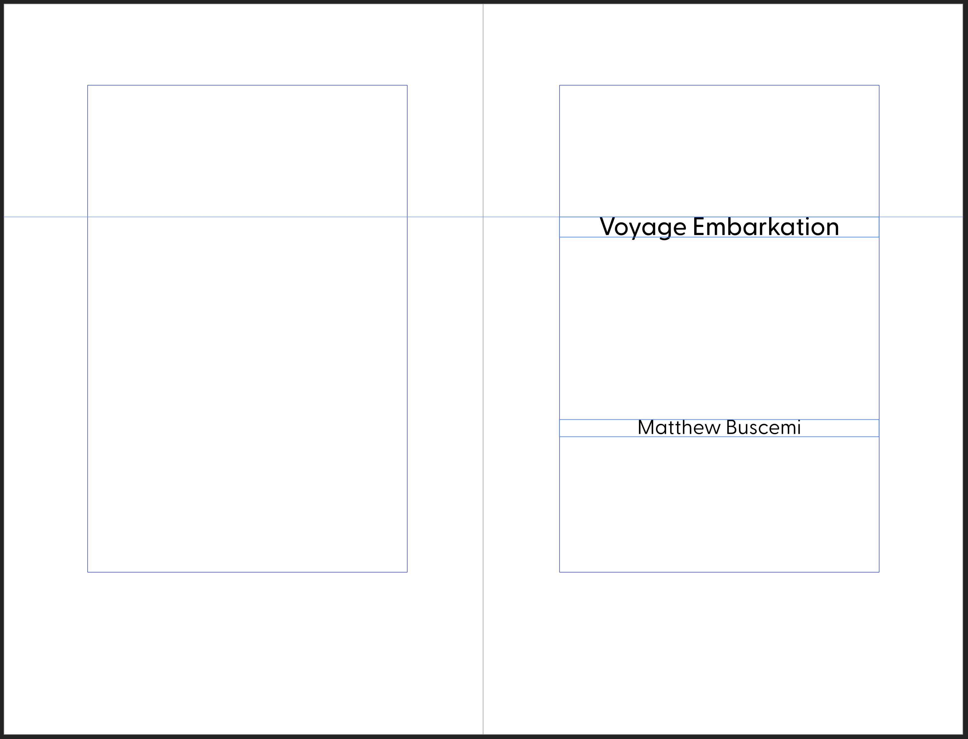
- The text block is laid out in a manner consistent with the van de Graaf Canon of page construction. The block needs to be moved toward the outer margin to appear correctly within a paperback (as opposed to a sewn-bound hardcover), but all other proportions are mathematically consistent with what is, in my opinion, the most beautiful text block positioning possible.
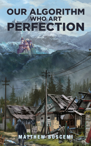
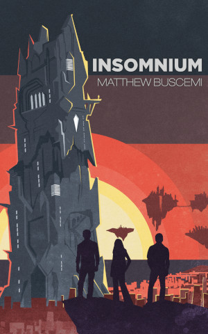
- Pages are largely free of ornamentation, save for some discrete and thematically appropriate elements (e.g. the string of binary in Our Algorithm, the theme of vertical bars in Transmutations, the large numbers in Insomnium, etc.).
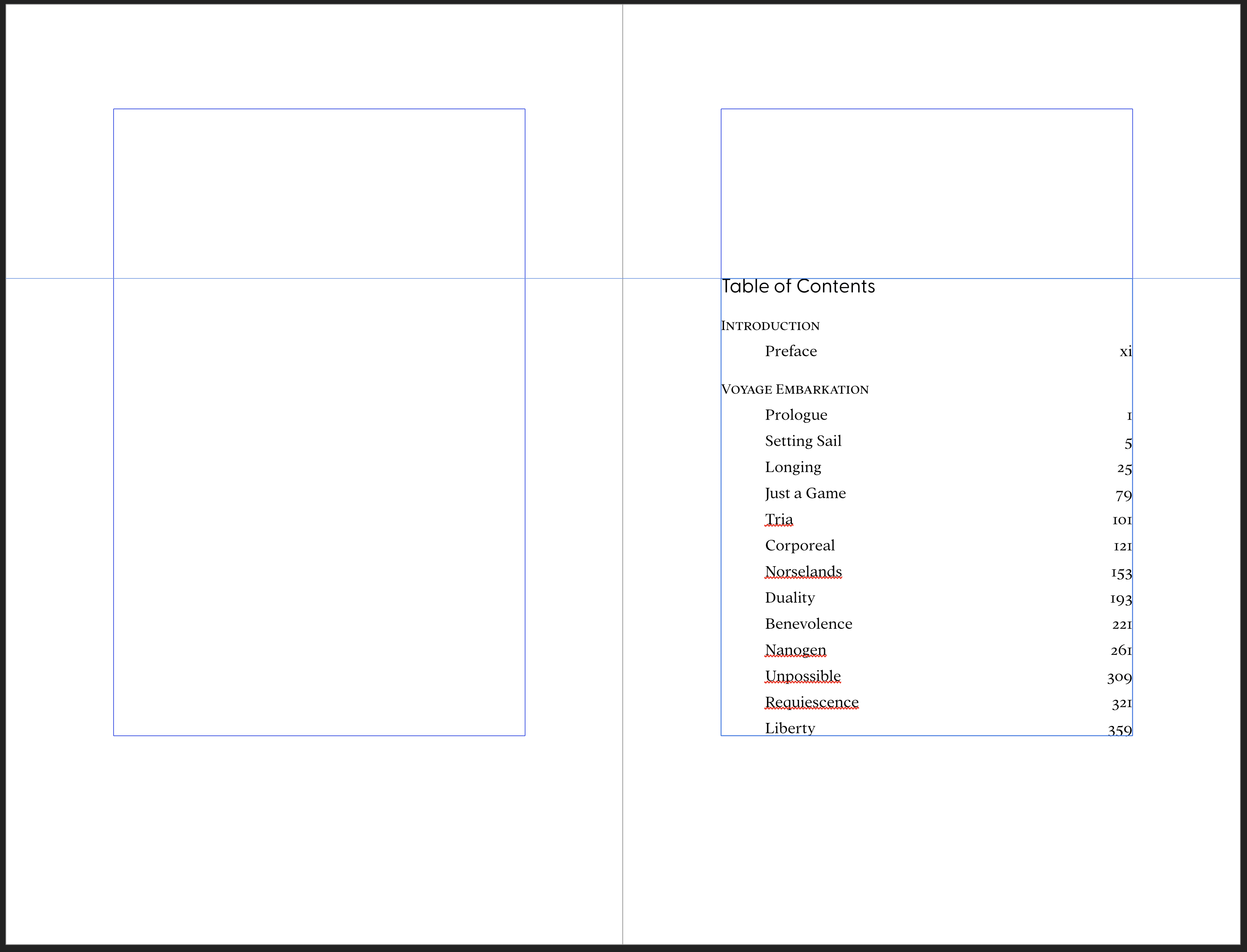
- Pages are also free of running headers. These were a useful tool for publishers in the days before digital print prep, when getting an unbound draft of one book accidentally mixed with an unbound draft of another could create hours or days of extra work unless the pages carried the name of the author and the book’s title. They serve no great purpose in the present day and they clutter the upper margin, in my opinion.
- Font choice, rather than being consistent across all books (as in my 2019 series), are different for each book and reflect each book’s individual character.
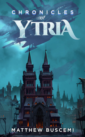
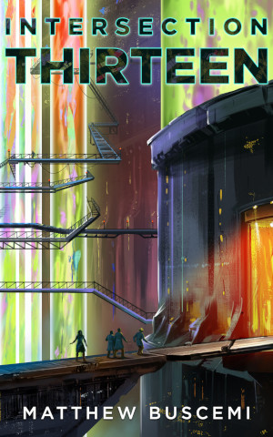
Although I am tempted to declare victory, having finally discovered “the” way I want to lay out my books, I know that such things are always a work in progress. There is always more to learn. I will carry these principles forward into 2021 for the designs of the upcoming Intersection Thirteen and Chronicles of Ytria, but I’m sure those projects will find a way of challenging me to learn something new as well.
Categories:
Tags: