The Typography of Insomnium
Thursday, December 17, 2020 at 2:50am
Insomnium is my second novel. It developed organically out of the frustration and emotional turbulence of the draft of what was supposed to be my second novel, Voyage Windbound (the successor to Voyage Embarkation). You can read more about that fraught history in the biographical material included in the new edition of Voyage Embarkation available tomorrow. For this post, I want to focus on Insomnium’s layout and design.
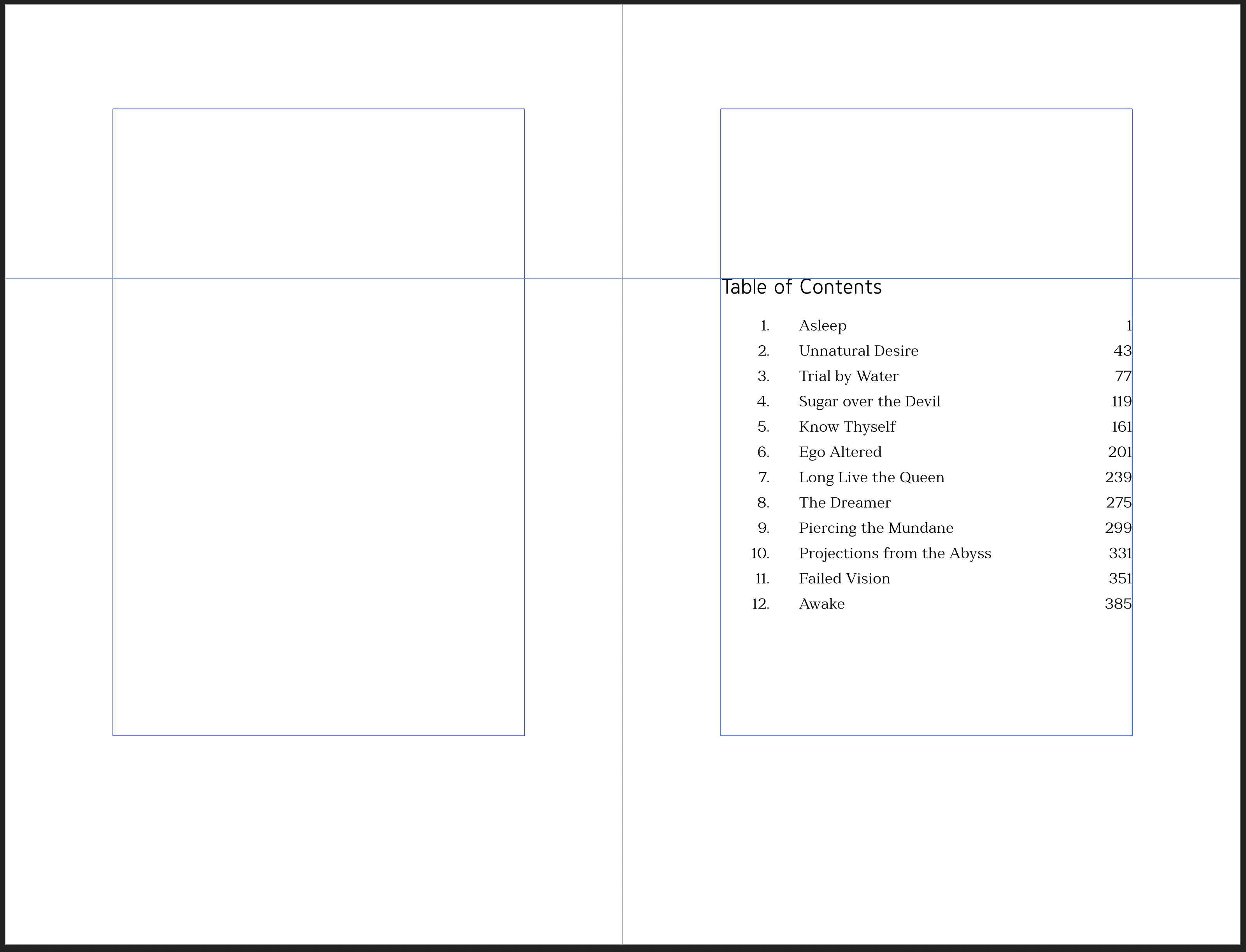
The first edition of the novel was my second ever attempt at doing a book layout. Upon returning to it, there were some elements that I liked, and some I didn’t. I actually made pretty good font choices, and I really liked the idea of making the chapter numbers larger than life. However, the way that chapter titles were pages all to themselves was jarring, and I’ve grown to dislike initial large caps and drop caps.
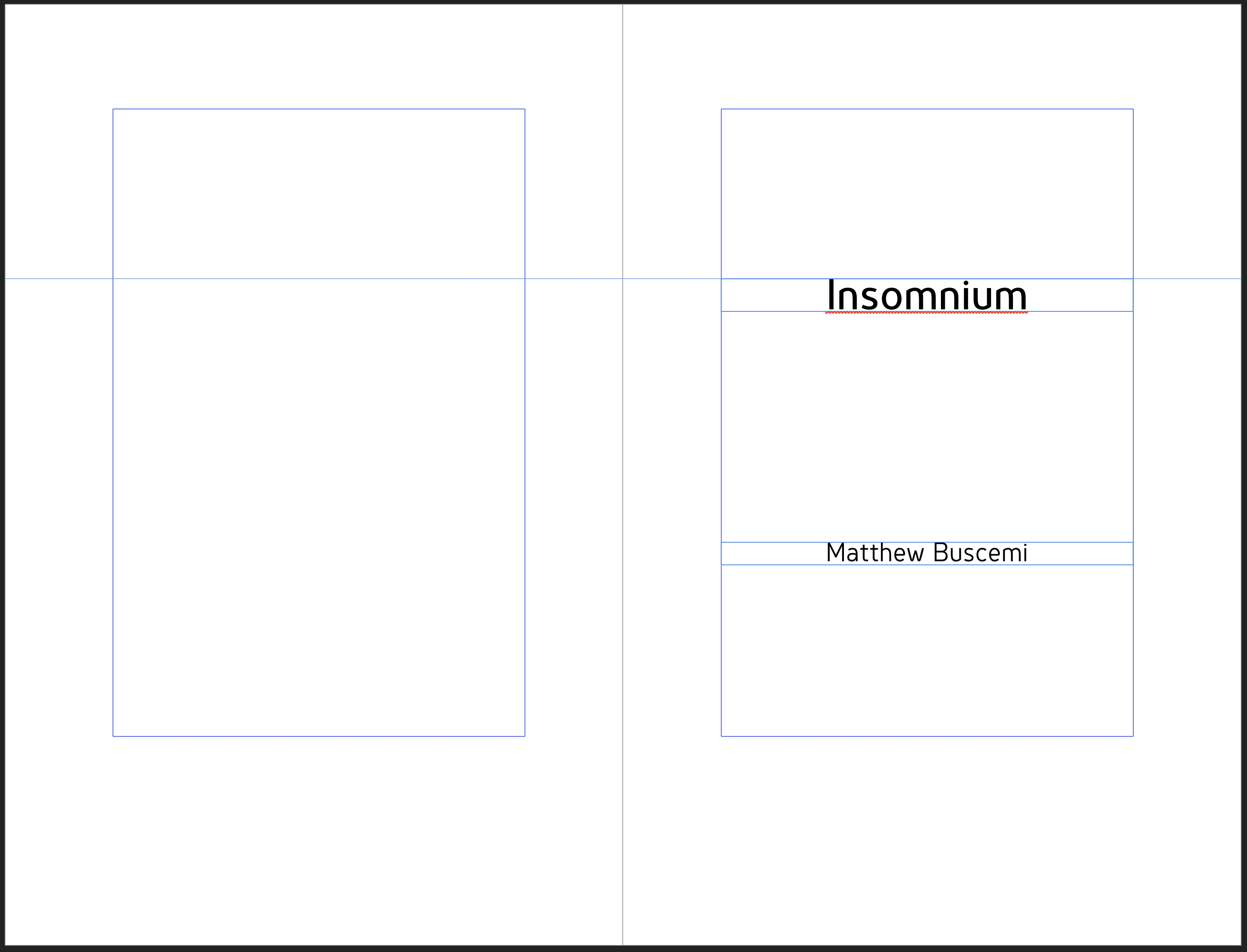
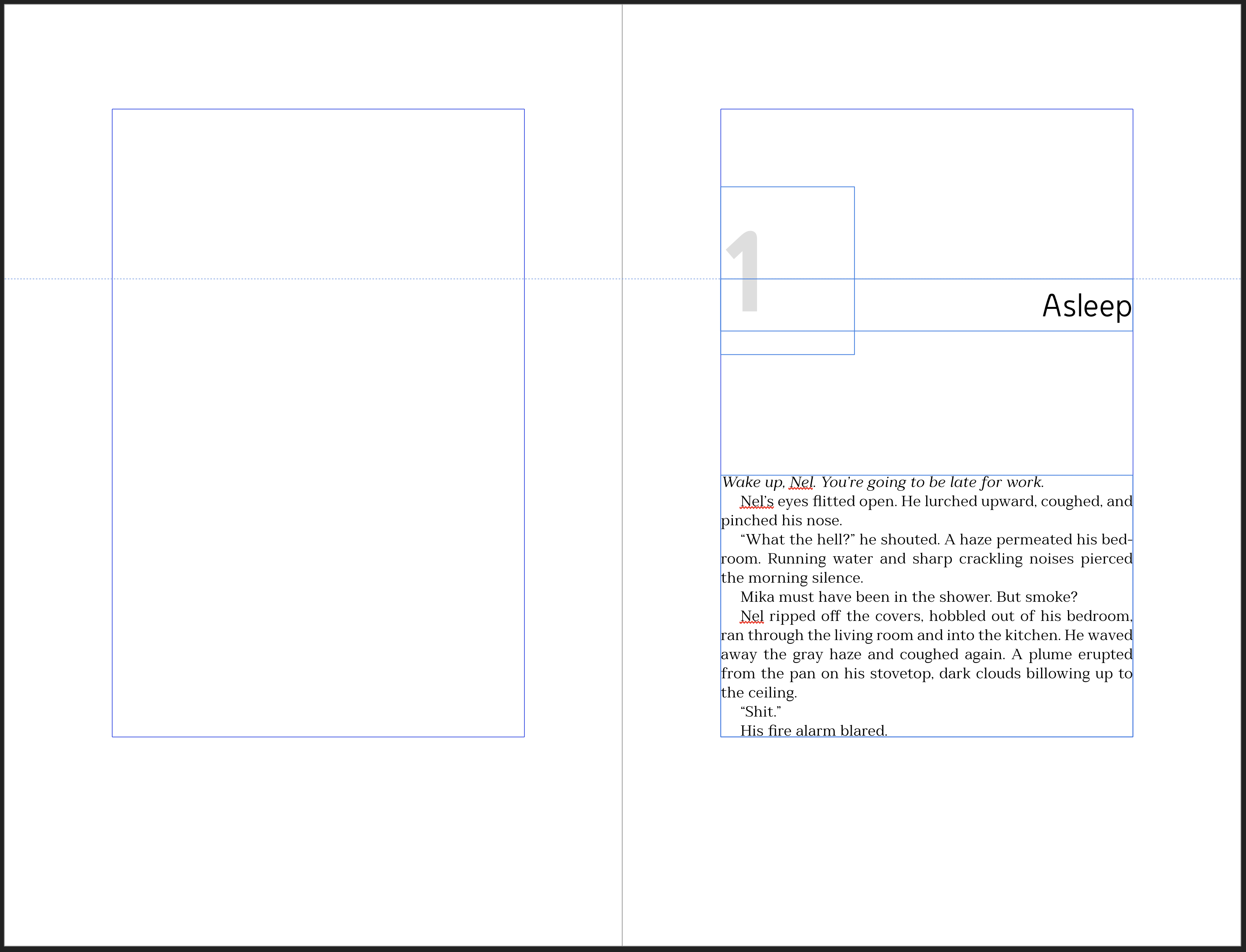
The text is laid out in Millard, another one of those fonts that is very readable, but if you stop and look at it closely you’ll noticed there’s something ever so slightly odd about it. It’s a little too round. But when you’re reading, you won’t notice a thing. The book’s display font, used for chapter titles and headers, is much more of an overt oddball. For that, I chose Genius. The two manage to complement each other well in that they are slightly discordant against one another (but not too much), which is perfect thematically.
I’m happy with how the layout for Insomnium turned out. This edition will serve me well for more than a few years.