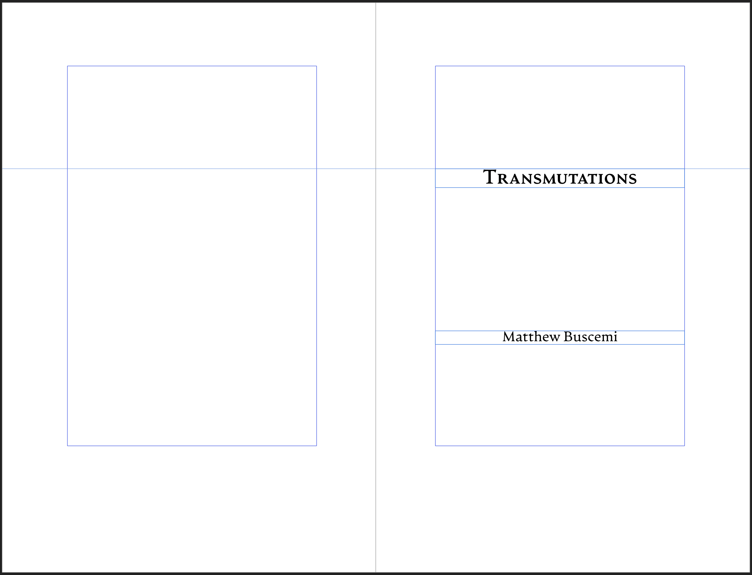
The Typography of Transmutations
Thursday, December 3, 2020 at 3:52am
Nearly one month ago, on November 6, the new edition of Transmutations went live. Most of my 2020 editions have been little more than a new cover and interior. Transmutations was the first release to introduce substantive changes.
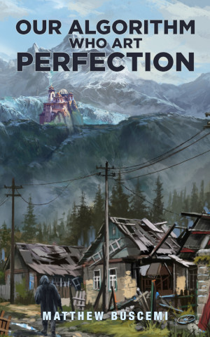
The biggest change is that the novella Our Algorithm Who Art Perfection was extracted from the collection and released separately as its own paperback and ebook. This necessitated some minor editorial changes to the introduction for the section Our Algorithm was taken from, as it no longer made sense to introduce the novella there.
There was also one other area where I decided to make some minor revisions. Transmutations is a compilation of stories from two previous collections: Lore & Logos (2014) and Transmutations of Fire and Void (2015). In 2017, I decided to collect up the best of those two books into a single collection. I organized the stories by theme and wrote introductions for each section. It would take me until 2019 to publish Transmutations, but I wrote the section introductions in 2017. This was shortly after I closed down my publishing company Fuzzy Hedgehog Press, and it is clear now that I wrote some of these introductions from a place of anger and resentment. I skimmed the introductions again in 2019 before publication, at which time I recall they only slightly rubbed me the wrong way. To my ear in 2020, one in particular sounded downright hostile. For the 2020 edition, I have made some minor wording modifications to that introduction. Largely, I have let the text stand.
Besides the aforementioned changes, the stories themselves remain unchanged.
Incongruous and disconcerting, but not, I think, distracting.
I feel I accomplished this same effect with the font choice. The entire book, text, headers and all, is laid out in a single font, Artifex CF. It reads well as a text font and allows you to get into the flow of a story. But, if you stop and stare at a page laid out in it, it’s quite striking, even a bit odd. Just the feeling I was going for.
Of course, re-formatting my flash fiction story Binary is always loads of “fun.” I loved what I accomplished with that story, but it seems as though every time I lay out this collection, I spent a quarter of the time checking and double checking that one three-page story.
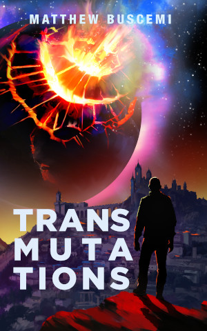
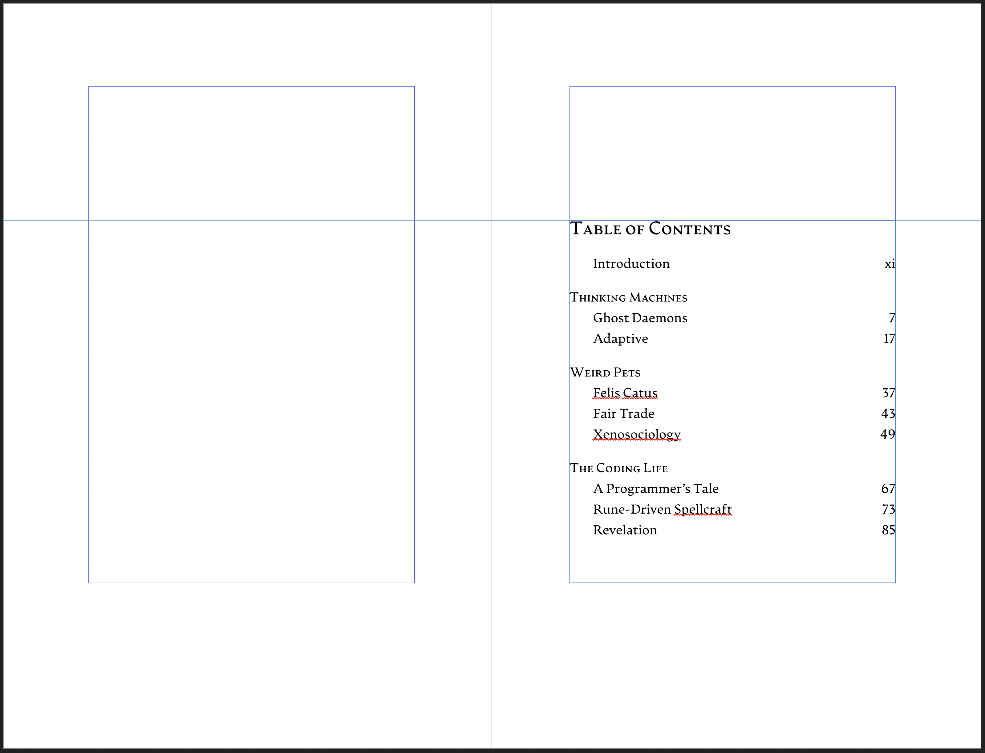
I remain proud of all the stories in Transmutations, but if you want to read my favorites first, check out Xenosociology, We Were Here First, Lunar Eclipse, Temple of the Setting Sun, and Shadowplay. It’s great to have these out with one of Zhivko Zhelev’s beautiful illustrations on the cover. You can grab a copy on Amazon in paperback or ebook.