The Typography of The Shipwright and Other Stories
Sunday, August 30, 2020 at 2:55am
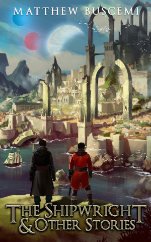
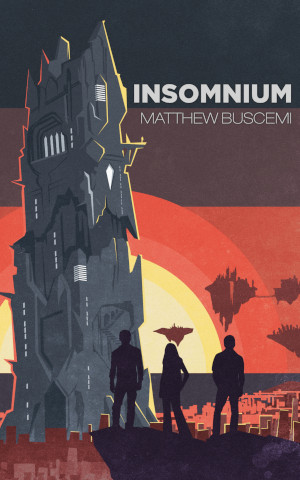
It is now six days until the release of the new edition of The Shipwright and Other Stories. This edition features not only a new cover by Zhivko Zhelev, but also a brand new interior layout. In this post, I’m going to talk about some of the typographic decisions I made for that design.
It is best practice throughout a book design for all elements on every page to adhere to the same blocking. The text block doesn’t just define the size and placement of the text block in the middle of chapters—it binds the placement of items in all front matter and back matter, too.
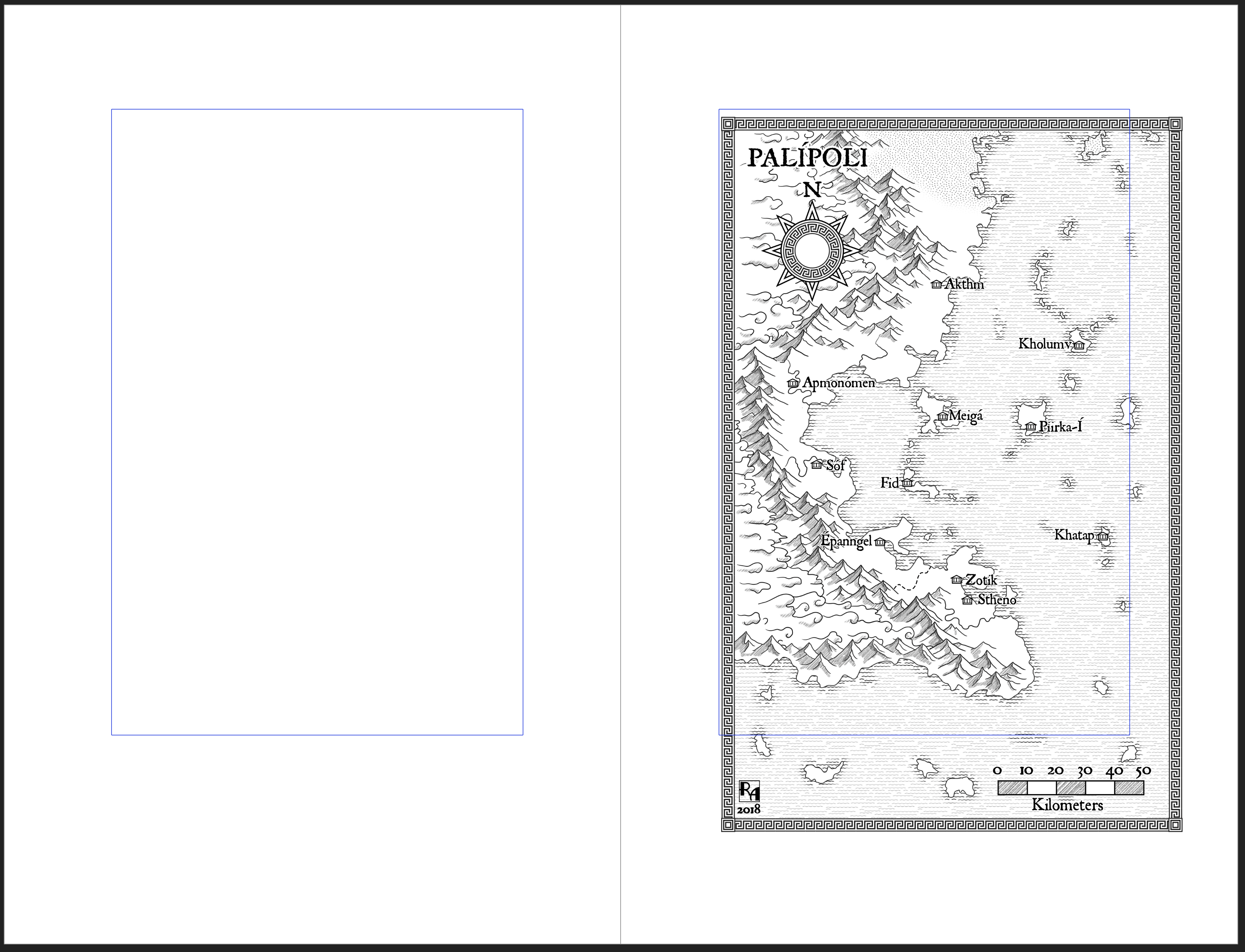
Unlike Schrödinger, Shipwright’s got a map. When I was laying out The Other, I made the discovery that forcing a map into the shape of the text block is decidedly unappealing. As you can see, the map is placed so that it will be as large as it can be on the page without going into to the unsafe print zone or rolling into the spine. This clashes with the text block, but it is decidedly more appealing when put into print.
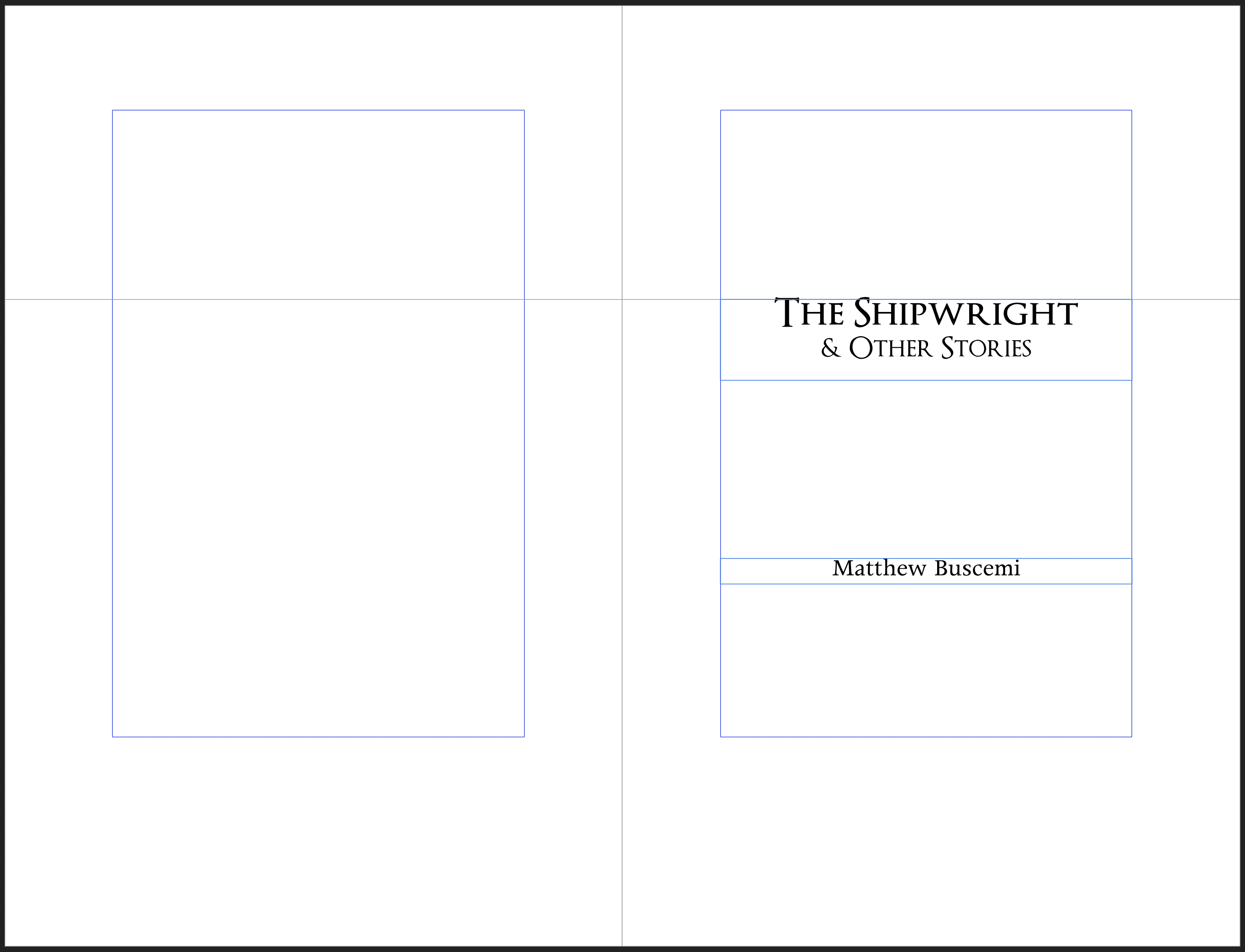
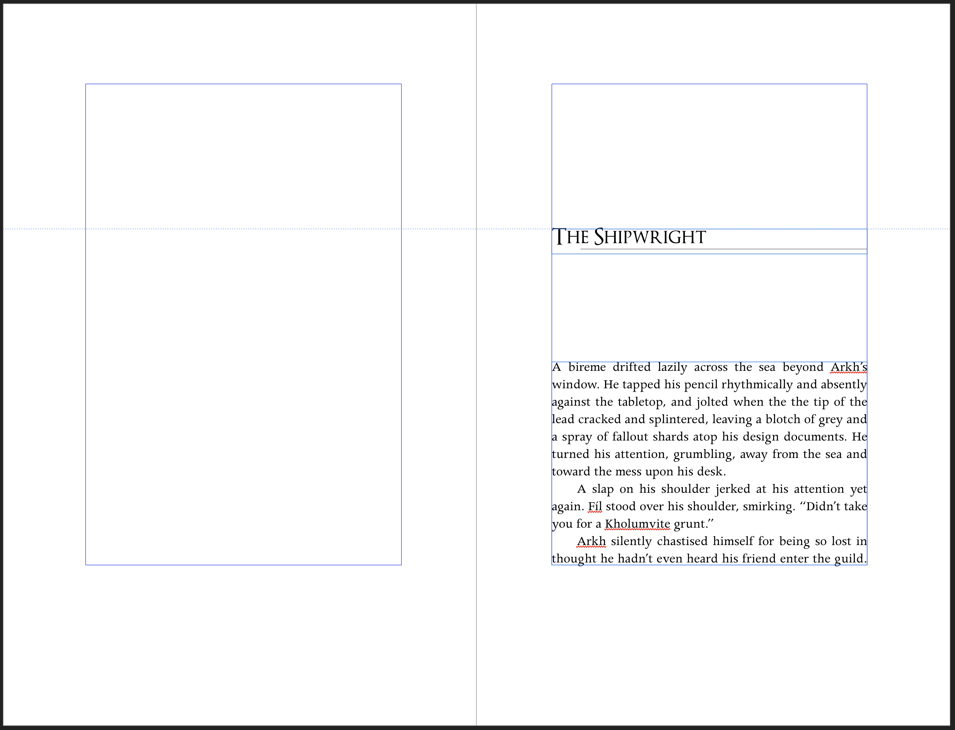
Zhivko Zhelev introduced me to the Optimus Princeps font, which he used for the title. I then applied it throughout the interior as a display font. The text font is Apollo, which looks great and has a nice resonance with the stories’ Classical inspiration.
One of the principles of book typography is that, if your design distracts the reader from the text, you’ve failed. The book designer is in the difficult position of needing to do something unique and interesting, but also needing to make sure that those unique and interesting elements are a subtle as possible.
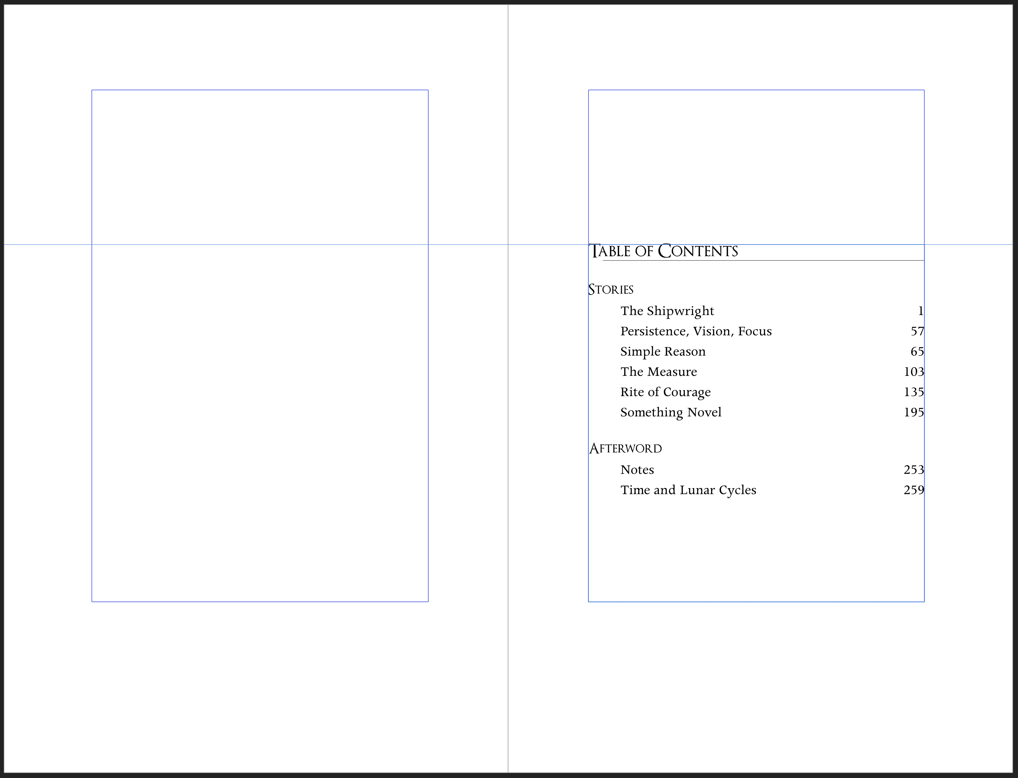
It feels almost ridiculous to write this, but for Shipwright, I tried 1-pixel-thick horizontal lines. I placed a long one below each story title on the story’s opening page, and I placed two short ones above and below the page number. I was pleasantly surprised with how appealing these look. They add Classical flavor without getting anywhere near overwhelming or distracting.
The text of the Shipwright is unaltered from the 2019 edition. Neither is there any new material. In contrast to all my other books, I decided to keep the afterword that was included in the 2019 edition. I found it still reads well to me now. I suspect the reason is that, unlike all my other books, whose afterwords I wrote in 2017 shortly after shutting down Fuzzy Hedgehog Press, I wrote the afterword for Shipwright in 2019 during the run up to its publication.
The new edition of The Shipwright and Other Stories will go up on Amazon this coming Friday, September 4. As with before, I will hit the buttons in the morning, and then it will take a business day or two for everything to get sorted within Amazon’s systems. Based on previous experience, I expect the ebook to receive the cover update within a day and the paperback to be available by the following Monday or Tuesday.